
- How to use the survey
- How the scores work
- How to create an action plan
- Run a results workshop
- Run an action plan workshop
- About the calculator
- The five ways to well-being
- Survey design
- Research background
- Glossary
- FAQ
How to use the survey
Creating happiness at work is really a journey rather than a destination – a process rather than an outcome. The survey can be used as a snap shot of how your organization is doing but to gain the most positive impact from using it we recommend that it becomes part of a wider process.
Getting the most out of the survey
The happiness at work survey uniquely gives individuals and teams instant access to their own results. This is to ensure that people do not feel the process is just an empty tick box exercise. To take full advantage of this feature we recommend that a series of discussion sessions be run for teams as well as action planning workshops. This will start to create a bottom up process that can contribute to, and compliment, organization-wide initiatives to promote happiness at work.
Support along the way
If your organization wants support on your journey to becoming a happier organization then we have experts available to help you.
![]()
What’s behind the survey
The happiness at work survey is unlike any other staff survey uniquely offering instant results that are benchmarked against national averages. Find out more about how is behind the survey, how it was designed, the research it is based on and how the scores are calculated under the Research background tab at left.
How the scores work
What the scores mean
![]() Index scores run from 0 to 10, where 0 is always the worst possible score and 10 is the best possible score. A score of 5.0 represents the national average and serves as a benchmark. So, by glancing at the index score it is possible to gauge instantly whether it is above or below the national average.
Index scores run from 0 to 10, where 0 is always the worst possible score and 10 is the best possible score. A score of 5.0 represents the national average and serves as a benchmark. So, by glancing at the index score it is possible to gauge instantly whether it is above or below the national average.
How the traffic light system works
We use a traffic light system along with the 0-10 index to make the data easier to understand. It allows us to present your results in colors as well as numbers.
The traffic lights work with the index scores to illustrate very poor, poor, average, good and very good scores. We set the cut offs for each color at approximately 20% so that each band represents about a fifth of respondents. This makes it easy to see if scores fall in the bottom 20% or the top 20%. The boundaries for the traffic lights are set out in the table below:
| Index score above | Index score below | Approximate % of respondents | |
| Very poor | 0.00 | 3.65 | 20% |
| Poor | 3.65 | 4.75 | 20% |
| Ok | 4.75 | 5.65 | 20% |
| Good | 5.65 | 6.75 | 20% |
| Very good | 6.75 | 10.00 | 20% |
Note: due to the different distributions the % of respondents in each traffic light category is not precisely 20% for every domain, sub-domain and question. Across all the questions the overall variation is between 15-25%. We decided to keep the same cut-offs for all the traffic lights rather than introduce the extra complexity of letting them vary between questions and domains. It is best, therefore, to consider them as guides.
How we calculate the index scores
All questions give respondents 7 response options, labelled 1-7 for ease of use. Each scale is anchored at each end with positive (always 7) and negative (always 1) response options. Each question has a unique pattern of responses that can be described by their different means, standard deviations and skews. To aid ease of use these response patterns are ‘converted’ to 0-10 index scores.
It should be noted that this transformation is for communication purposes and is not suitable for technical analysis such as regressions and correlations. These should be carried out with raw results. Please contact us for details of our bespoke analysis services.
How we calculate the benchmark scores
The survey benchmarks are based on nationally representative surveys of 1,392 and 2,959 employed adults (aged 18 and older) in the UK and US respectively. The surveys used the same questions in both the UK and US and were conducted online at the same time in October 2011. The national benchmarks can be considered to be statistically accurate to within a 2% margin of error.
An ‘international’ benchmark is provided for non-UK & US residents. This should be considered as a ‘synthetic’ benchmark as it has been calculated using the full sample of 4,351 employed adults in the UK and US. Alternative methodologies were explored, including using the World Value Survey or European Social Survey as scaling devices. However using such techniques would undermine the advantage of our methodology, which is directly based on actual responses to questions in the survey. In line with this principle other national benchmarks will only be added when we have robust data for them.
Question response percentages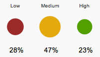
When answering the individual survey questions respondents use a 1-7 scale – where 1 always represents a negative response to the question and 7 a positive response. As another way of viewing the data we show the % of respondents scoring a low, medium and high score. For these purposes a score of 1-3 is categorized as LOW, 4 or 5 MEDIUM and a 6 or 7 as HIGH. They are shown as round traffic lights – with the size of the circles visually representing the percentage of respondents in these categories and the colours of red, amber and green representing the low, medium and high categories respectfully.
As these scores are actual responses they do not include the national benchmark information, however they can be used as the basis for internal organizational comparisons through time – i.e., in order to observe improvements in happiness at work by the rising percentage of employees in the HIGH category.
How to create an action plan
Happiness at work results from your own actions, those of other employees, and the organization itself. Let’s begin with exploring your individual results and developing your action plan to be happier at work. Later on, your team or organization may explore these results and develop related action plans. Starting with the here and now, you can use your results to think about the details of your day-to-day working life that are within your control. Are there changes to what you do or the way you do things that would improve your happiness at work?
Using the guide below, you can create an action plan in four simple steps.
1. Look at your results
First, look through your results again. You can use either the happiness landscape for a broad view or the dynamic model to identify the interconnections between different risk and strength areas. Take notice of what is going well (the greens) and what isn’t going too well (the reds). Our list of your best and worst five scores can help you here but also look out for what ‘strikes a chord’ or ‘rings true’ for you.
2. Brainstorm ideas
Next think about how you can build on the greens, improve the ambers and address the reds. Give space to your insights. It is often really helpful to brainstorm with someone else – a friend or a colleague – because they can act as a sounding board. At this stage no idea is too crazy. Just make a note of all your ideas.
Put them in a list and note which greens, ambers, reds and/or insights each idea addresses. Notice that some ideas might address several issues simultaneously.
Also note which ideas…
- you could carry out on your own
- you could carry out with the help of others or extra resources
- you require other people to carry out
3. Prioritize
Look at your list of ideas:
- Which ones feel the most easily achievable?
- Which ones feel the most important?
- Which ones do you have the most interest in or energy for?
Choose between three and five of the ideas. Choose at least one that is easily achievable. Choose at least one that feels very important. Choose at least one that you have a lot interest in or energy for.
For each of your chosen ideas decide what you have to do to put them into action. Make a note of these steps. Set yourself a realistic target for when you are going to start doing each step.
4. Get started!
Try things out. Do more of what works and set aside what doesn’t. It is important not to try to change too much all at once. Check back to your master list and update it to reflect how you are doing. Maybe new ideas will come to you – that’s great! Add them to the plan.
Your happiness at work action plan can be a living, changing, flexible one. But remember creating happier work doesn’t just happen magically – it will require some effort…
Run a results workshop
Looking at the happiness at work survey results all together helps create a shared understanding of where your team really is.
To run a workshop to discuss your team results we suggest you get everyone together in one room with a computer, an internet connection and if need be – a projector. Schedule a generous amount of time for the meeting – between 1 ½ and 2 ½ hours. A whole morning or afternoon if you are also going to create action plans.
In terms of an agenda, we suggest the following activities:
- Talk about the results. It is good to get everyone talking about the results. Try to ensure that everyone in the room gets a chance to have a say. Quieter people in the room normally have excellent things to say but are often less forthcoming. Conversely some people can be very forthcoming – it is good if they can stand back sometimes to give space to others. Don’t be afraid of some silences – sometimes reflection time is needed. Some useful prompts can be:
- What do you care about?
- Does anything surprise you?
- What doesn’t surprise you?
- Explore the results. There is no right way to explore the results. You can go through them systematically, looking at each area in turn. Or you can take a more organic approach, following where the energy and interest takes you in the room. Notice that we are naturally drawn towards the red lights and the less good results so make an effort to take notice of the green ones too!
- Look at the results. There are different “views” of your team results: happiness landscape, highlights & lowlights and dynamic model. Use whichever of these that you feel most comfortable with – or in combination – but be aware that if you use the happiness landscape view that your team’s results cover the whole range indicators not just the one labelled “our team” – which reflects team relationships only.
- Take a mood check. It is a good idea to start by asking everyone to say how they are feeling about seeing the group’s results. Some people may be curious – others anxious or cynical. This mood check gets everyone’s voice heard straight away.
- The Big Picture. Once people have had time to explore the results, direct attention to the big picture – the results overall. How do they feel about them now? Are they feeling different than when the workshop started? Do they ‘see’ anything differently now?
- Small group time. If you have a large group it can be good to split up into smaller groups of 4-6 people. Give the groups about 45 minutes to an hour to look at the results together and identify:
- What is going well?
- What is not going so well?
- Remind the small groups to ensure that everyone gets to talk. Also ask them to select a spokesperson to report back to the main group.
- If you have several teams it can now be a good time to split into teams and go look at their team’s particular results but following a similar process. Teams do not have to share their results if they don’t want to but it is helpful for them to share their insights.
- Goods and Bads. Get everyone together again and ask the spokespeople to share about their group’s insights. Make a list on a flipchart of the ‘goods’ (things going well) and the ‘bads’ (things not going so well). Allow a space for emerging common themes too.
Now all the common themes and ‘goods’ & ‘bads’ have been listed it is time to create a “making work happy” action plan in the next tab.
Run an action plan workshop
The basis for good action plans is to come up with good ideas that can be put into action! The process can follow straight on from the results session or soon afterwards but avoid big gaps between the two as you will lose momentum. It can be great to come up with ideas in a workshop but you can also ask people to submit ideas by email or on postcards.
- Brainstorm ideas. Ask people how you can build on the goods and address the bads. At this stage no idea is too crazy. Collect as many as possible. You can use nef’s five ways to well-being (see tab at left) as a framework to help people to help create ideas.
- Map the ideas. Put the ideas in a list and note which goods and bads each entry responds to. Notice that some ideas might address several goods and bads simultaneously.
- Prioritize. Look at the list together. For each idea, consider the following three questions
- Does it feel important?
- Is it easily achievable?
- Does it require support or resources that are not available in the room?
- Find the energy. Remind people that making work happy doesn’t just happen – we all have to make it happen. Go down the list of important ideas and ask who is interested (or has energy for) each idea.
- Create an action plan.
- Choose some ideas that are easy to action.
- Choose some that are very important.
- Choose some that people have a lot of energy for.
- Be mindful not to choose too many ideas to start with as you can re-visit ideas at any point in the future. Try to get as many people involved as possible.
- Get started! Keep coming back to the action plan. Update it to show progress. Share in places where people will see it. Some activities will not work. Old ideas should be revisited. New ideas should be added. It is a learning process, which can be captured in your living action plan. Making happy work will not happen magically – it will require effort … but it will also be fun and rewarding…
About the calculator
Happiness is a serious business and there is a straightforward business case for promoting it in every organization however big or small. There are lots of potential costs savings as well as the opportunity to improve productivity and customer service. Along the way you also happen to create more rewarding happier jobs for people too!
Our on-line benefits calculator is based upon modest assumptions about the impact on your bottom line. Potentially the gains could be even greater and we have allowed you to play with adjusting the main assumptions so you can see for yourself.
Happier employees are more productive employees
Study after study shows that happier employees are more engaged, more motivated, give better customer service, play more effective roles in teams and make better leaders.
Happier employees are healthier employees
Happiness and health are interconnected. Happier employees are less likely to get sick and if they do get ill they recover quicker. All in all they show up to work more, are more present when they are there and have more energy in life.
Happier employees are more loyal
Happier employees are less likely to leave. This is self-apparent, why leave if you are happy at work?
Other potential benefits
- Talent attraction. If you are a great organization to work for, great people will want to work for you.
- Innovation. Happier people are more creative and highly functional teams can positively embrace new ideas and better implement them.
- Improved customer service. In service based organizations the relationship between the service provider and the service users is critical and is greatly enhanced with more confident happier employees.
- More fun. No one wants to go to work to be unhappy and promoting happiness at work will simply make your workplace a better place.
Are there costs to creating happiness at work?
Following through on insights from the survey will certainly cost some internal resources and possibly some external consultancy. However these need not be large and we suggest you think of them as ‘investments’ not costs!
Happiness at work will release hidden energy and potential within your organization and whilst it will change the way people do their work it will not ‘cost’ them in terms of time or resources.
Assumptions behind the calculator
Average wage = $40,000; £24,500
In the USA the national average wage in 2010 for people in employment was $41,674 (source Office of Chief Actuary, U.S. Social Security Administration). In the UK the figure for 2010 was £24,000 – which is equivalent to about $39,000 (source Office National Statistics, Labour Market Bulletin 2011). We choose a round figure between these two national averages.
Productivity gain = 1%
This is a very modest assumption. Many studies suggest that the differences between productivity of those with low well-being and high can be as much as 30%. It is however difficult to find studies that show how much productivity increases as a direct result of interventions designed to increase happiness and well-being in an organization (note: we would like to work with you on this!). Hence we choose a very low figure. You can adjust the assumption up and see for yourself that the effects are very large regardless.
Days lost through absenteeism a year = 4 – 8 days
New figures released in the height of the recession in the UK suggest that absenteeism is at an all time low of just 4.5 days. Fear and insecurity can also reduce absenteeism but these gains will probably be lost as and when the economy recovers. People wanting to be at work is a better motivator for reducing absenteeism and has the added benefit people also being present and energized. The UK figure is from estimates by the UK department for Business, Innovation and Skills (BIS). We actually don’t use this figure precisely as we give you the option of choosing how many days of absenteeism it will save. Approximately 40% of absent days in the UK are directly due to mental health problems such as stress (source Sainsbury Centre for Mental Health; Developing the business case for mental health at work).
Staff turnover = 16% at a cost of 40% of annual wage.
The average figure for the UK is 16%, for the US it seems to be higher but the US has stronger seasonal effects than the UK. We take the UK figure here. The costs of each member of staff leaving are assumed to be 40% of annual wage. It will be significantly lower for seasonal work (hence low US turnover assumption) but higher for senior management positions. This estimate includes the direct costs of recruiting as well as knock-on effects of hiring temporary staff and/or increased burdens on existing staff. (source Sainsbury Centre for Mental Health – as above)
The five ways to well-being
The five ways to well-being are a set of positive actions that have been developed to help people get started on their way to a happier life. While we all have different circumstances and different likes and dislikes, these five ways are broad enough for you to find your own style of happiness. Try them out at work and in your daily life. See how well they work for you and tell us how you get on…
Connect…
With the people around you. With family, friends, colleagues and neighbours. At home, work, school or in your local community. Think of these as the cornerstones of your life and invest time in developing them. Building these connections will support and enrich you every day.
Be active…
Go for a walk or run. Step outside. Cycle. Play a game. Garden. Dance. Exercising makes you feel good. Most importantly, discover a physical activity you enjoy and that suits your level of mobility and fitness.
Take notice…
Be curious. Catch sight of the beautiful. Remark on the unusual. Notice the changing seasons. Savour the moment, whether you are walking to work, eating lunch or talking to friends. Be aware of the world around you and what you are feeling. Reflecting on your experiences will help you appreciate what matters to you.
Keep learning…
Try something new. Rediscover an old interest. Sign up for that course. Take on a different responsibility at work. Fix a bike. Learn to play an instrument or how to cook your favourite food. Set a challenge you will enjoy achieving. Learning new things will make you more confident as well as being fun.
Give…
Do something nice for a friend, or a stranger. Thank someone. Smile. Volunteer your time. Join a community group. Look out, as well as in. Seeing yourself, and your happiness, linked to the wider community can be incredibly rewarding and creates connections with the people around you.
About the five ways
The five ways to well-being are a set of evidence-based actions to improve personal well-being. They were developed by the centre for well-being at nef (the new economics foundation) as part of the UK Government’s Foresight project on Wellbeing.
You can order Five Ways postcards and download the Five Ways report from the nef website as well read other related research on how well-being can radically inform public policy.
Response codes
All questions use a 7-point Likert-type scale. A Likert scale is one that allows people to give varying degrees of positive or negative response to a question or statement. A 7-point scale is generally considered to be best practice; though some surveys use 5 point scales right through to 11 point scales.

In our experience using more response options can cause some confusion amongst respondents as they ponder whether this particular item deserves a six or a seven. In contrast a scale shorter than 7 does not allow for enough differentiation. The choice of 7 response options is considered to be a good balance between these two tensions. There is also debate amongst academics as to whether it is better to have an even or odd number of response codes options. Some researchers like to be able to categorise responses as positive or negative and so don’t want a ‘middle’ code option that an odd number inevitably produces. Other researchers believe that it is best practice to give respondents the opportunity to indicate a middle position, because this may best reflect how someone actually feels. This is the argument that persuades us to use a scale with an odd number.
Response anchors
All the questions use ‘anchors’ at each end of the 7 point Likert-type scale. In this survey we use lots of different anchors. For the question, “In general would you say that you feel happy when you are at work”, we used “not at all happy” at one end of the scale and “extremely happy” at the other.
Anchoring the extreme ends of the scale rather than naming each specific number on the scale is considered to be best practice, especially when doing international studies. For practical considerations, the language required to name each response option on a scale can become clumsy: extremely happy, very happy, somewhat happy etc. These problems become exaggerated when translating into different languages as words like ‘somewhat’ have different ‘strengths’ or meanings.
The use of anchors also allows more flexibility as the negative anchor can be worded as either a strong negative “extremely dissatisfied” or an absence “not at all happy”. We predominantly use the ‘absence’ anchors as they tend to stretch responses across the codes options more. However, for some specific questions which already have extensive academic usage with strong negative anchors, such as the question we use about job satisfaction, we have chosen to stick with the norm.
It is also worth noting that we have deliberately stayed away from agree-disagree statements. The reason for this is that research has suggested that agree-disagree scales suffer from what is called ‘acquisition bias’ with some respondents not liking to ‘disagree’ with any statement. Having more item-specific anchors – that vary from question to question – also increases the reliability of the data gathered.
Research background
nef inside
The happiness at work survey is based on over ten years of research into measuring happiness and well-being by nef (the new economics foundation). nef is a UK based think tank with a consultancy arm and home to the award winning centre for well-being. The centre was founded in 2001 by Nic Marks to address a simple question: “what would public policy look like if well-being was its aim?” Much of the centre’s work is focused on measuring well-being and communicating the findings of psychological research on happiness and well-being with an emphasis on creating real change. Recent work includes: Five Ways to Well-being, the Happy Planet Index, Measuring our Progress and National Accounts of Well-being.
The questions
The questions in the survey have been carefully selected for their face value validity and psychometric qualities – in other words do they fit with our model of happiness at work and are they statistically robust? Many questions have been developed specially for this context and are unique to the happiness at work tool but others have been adapted from existing sources. These sources include the well-being module that nef co-designed with the University of Cambridge and other leading academics for the European Social Survey (rounds 3 & 6), the European Working Conditions Survey and the UK Labour Force Survey.
A dynamic model of well-being
The model behind our tool is based on nef’s work with the UK Government Office of Science’s Foresight Programme. For the project report we developed a measurement framework that integrated different academic approaches to understanding well-being into one coherent model.

The model describes how an individual’s external conditions (bottom left) – such as their income, employment status, housing and social context – act together with their personal resources (bottom right) – such as their health, resilience and optimism – to allow them to function well (middle) in their interactions with the world and therefore experience positive emotions (top).
The model shows how different aspects of our well-being interlink and how improvements in one area influence other parts of an individual’s experience.
For happiness at work, we have applied this thinking to the work context, creating indicators that describe how the organizational system interacts with the resources employees bring to work to support people to do well and feel good in their jobs. We believe that through better understanding of these connections, individuals and organizations can identify the changes that will have the biggest impact – both for employee happiness and business success.
Happiness landscape
We also developed the Happiness Landscape which is an alternative representation of people’s scores. We grouped the indicators together differently to provide an overview of how individuals and organisations are faring, much like a dash board.
Glossary
Question
A question is the wording of the statement or phrase that the respondent answers.
Response option
Response option refers to the possible answers to a question. In this questionnaire the core survey uses seven response options (numbered 1 – 7) that elicit a range of responses from negative (always 1) towards positive (always 7).
Anchor
Anchor is the phrase used to describe the extremes of the response options – for example “Not at all happy” (1) to “Extremely happy” (7).
Scale
In this survey tool we use the word ‘scale’ to refer to the set of response options for respondents to choose from. So we might use a phrase like – “responding on a scale from 1-7”. We only use the word scale to refer to the actual responses to individual questions.
Item
An item is the term used to describe an individual question and its scale of response options.
Response
A response is the specific response option chosen by respondent to a certain ite
Average response
The average response is the arithmetic mean of all (selected) respondents responses to a specific item. The average response will be on the scale of 1-7 and will not normally be a whole number. Note: averages are only available at the individual item level – indexes are used in all other cases.
Median response
The median response is the most popular response by all (selected) respondents to a specific item. The median will always be one of the seven response options on the scale of 1-7. Note: median responses are only available at the individual item level.
Concept
A concept refers to an idea that an item or a group of items is trying to assess. For example, whilst the overall concept assessed by the survey is ‘happiness at work’, this is achieved by assessing many narrower concepts such as ‘positive emotions’ or specifically ‘enjoyment’.
Domain and sub-domain
Domain and sub-domain are the terms we use for a group of items that together create a measure of a coherent concept. For example in the Happiness Landscape view ‘me at work’ is a domain made up of four sub-domains: ‘positive emotions’, ‘negative emotions’, ‘engaging work’ and ‘my relationships at work’. As a sub-domain, ‘positive emotions’ is itself made up of two items: experiences of ‘enjoyment’ and ‘happiness’.
Index
An index is calculated for each item, sub-domain and domain as well as overall happiness at work. Indexes are calibrated so that scores across all items, sub-domains and domains are equivalent and easily comparable. Index scores run from 0 to 10, where 0 is always the worst possible score and 10 is the best possible score. A score of 5.0 represents the national average and serves as a benchmark. More details of the calculation process can be found on the how the scores work tab.
Score
We use the word ‘score’ to denote the result of the index calculation for a respondent, or a group of respondents. So we use phrases such as “your score is 5.6”. Scores run from 0 to 10, where 0 is always the worst possible score and 10 is the best possible score. A score of 5.0 represents the national average and serves as a benchmark. More details of the calculation process can be found on the how the scores work tab.
Benchmark
Our benchmark allows individuals and organizations to know how they are doing in comparison to the national average. The benchmarks are based on nationally representative samples from both the US and the UK. The national benchmark is used to calibrate all the indexes with a score of 5.0 always being the national average. At an individual item level the benchmark is equivalent to the national average response.
Traffic lights
We use a traffic light system along with the 0-10 index score to make results easier to understand. The traffic lights work with the index scores to illustrate very poor, poor, average, good and very good scores. For example a score of 7.2 can be considered ‘very good’ whatever concept is being assessed. We set the cut offs for each colour at approximately 20% so that each band represents about a fifth of respondents. This makes it easy to see if scores fall in the bottom 20% or the top 20%. More details of the traffic light system can be found on the how the scores work tab.
FAQ
Is the survey anonymous?
Yes. Only you can see your personal responses and scores. Other people in your organisation may be allowed to see grouped results (everyone in a team for example) but these groups will always have at least 3 respondents. This ensures that individual responses are always confidential.